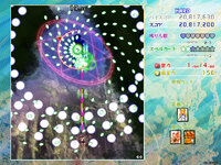
Game board? That sounds like a better term than "Player UI" as I call them in my Touhou logo analysis, though I'm sure there a more technical term out there for describing this STG game element. Anyway, my favorite boards are SA, ISC, and VD. As an bonus response, I say my least favorite board is LoLK.
SA features what I consider to be the best board logo during the 2nd generation of Touhou games, back when ZUN gave the board a unique logo separate from the title screen logo. Frankly, this board radiates album art vibes with how the logo plays with how a title can be "read", yet also used as a visual element. Plus, the board's background take on dark colors helps reflect the underground setting and make the board easy to parse from a quick glance. Bonus points for having symbolic reference to the final boss for acting as foreshadowing for who the final boss is right from stage 1. That foreshadowing gives SA a sight sense of mystery. Overall, I like this Player UI for its visual appeal and being clearly relevant to the game's setting.
I like how dark this board is. I like how the glossy the textures are. And I like how the board works together with Seija's items to make them clearly stand out onscreen. It may be one of the more geometric boards out there in the Touhou games, but this works well with Seija's role in ISC. After all, she running away from danmaku designed not for elegance, but for impossibility.
I can't help but feel entranced from this pseudo 3D effect as if we, the players, are using a window to see into another world. The use of this design for the board is thoughtful of how Sumireko's fought against her nightmares with a phone, which happens to be the initial evidence that got Sumireko to believe her nightmares were more than just a fantasy. Although, the violet light this board contains can be stressful on the eyes when the game is played for a long period of time. The colors certainly add to the organized chaotic factor the game has for its plot, but I do find myself wishing that the board used a different color palette to relax the eyes. Perhaps this too is another reminder to remember that fantasy cannot be reality, for there are biological factors that must be considered in order to have an enjoyable experience.
Legacy of Lunatic Kingdom
I have decided to talk about this board as an example on what to not do when designing for the player UI. The issue with this board is how messy it is as a result of how cleanly divided the shapes are with its colors of blaring reds, poppy pinks, and swinging tangerines. I can see where each lines is traveling from here or there, but the purpose of the board is not to distract the player with its artful design such that the player will fail to see the danmaku right infront of them. Plus, this board doesn't give me any strong connections to the game's setting outside of colors that may reflect on motifs of the Lunar Capital and Junko. But regardless of what I feel about the board itself, there is one more impurity in this board worst than any of the issues I have mentioned so far. The flower in LoLK's logo is too hard to see.
LoLK's logo is experimental to say the least. On one hand, the hollow appearance of the flower gives a rich earthly background to the logo that geometric logos can't replicate to the extent of the LoLK logo. On the other hand, the logo's hollowness means the logo needs to be placed on the appropriate background, otherwise the logo will be overshadowed by its surroundings. This is the mistake of LoLK's board as its bright colors of reds, pinks, and yellows overshadow the dark red flower. Additionally, the board leaves no space for the logo stand out on its own, as the board's background leaves no empty space for the flower design to be imprinted on to the board itself. Instead, the flower competes for visual space with the board's flower textures that I am left wondering if the board ever considered what the LoLK logo was going to look like. The board is not designed with LoLK's logo in mind, and that is the impurity this board has. No other board from the Touhou games has logo visibility issues quite like LoLK.