
Pinky Cat
Suzunaan Reader
Touhou games logos are the visual element that describes a game’s title with 東方 (Touhou), some Japanese characters, and finally an English subtitle to finish the logo. What interesting is how Touhou games over the years have went though various design trends in not only visual design, but also in logo usage. As such, I be conducting analysis on each Touhou game on their logos, commenting on the design, and describing the game’s logo usage, to identify the trends on Touhou game logos.
By the way, the images used in this analysis were sourced from THB Wiki, Touhou Memories, and my own personal screenshots. Huge thanks to THB Wiki and Touhou Memories for cataloguing their images in an accessible format.
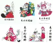
CD covers of PC-98 games
In this era, how advanced a logo could be would have been limited, either by the PC-98’s technical limitations or by ZUN’s limited design experience. As a result, these upcoming logos are more or less basic, though their logo usage differs much from later Windows games. For instance, a common trend for this era is that all CD covers logos share the same style: a black inky style. It’s very basic for a logo, appearing to act more as supporting visual elements that gives the PC-98 covers an old scroll vibe to them. More importantly, these inky logos are dissimilar to the logos used ingame, a trend that would be changed in later eras. For now, let’s take a look at their digital logos.
Title Screen
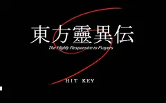
This is a basic Touhou logo, with white text composing of the Japanese Characters, 東方+ 靈異伝, leaving the English subtitle right below. The only unique flourish HRtP offers is the red swirl, whose curved path edges just around 方 and 異, giving off a geometric vibe. Though, the swirl centered on the bottom half of the Japanese rather than centering on the logo makes the swirl feel it was not intended to be part of the logo. Still, it is a basic logo that carries a unique visual that can be related back to the game.
As for what the red swirl means, it’s bit too abstract from the game to say an objective statement about it. But as a personal thought of mine, the red swirl is the path of the Yin-Yang orb traveling across from the edge of the screen to the center, where a boss is usually place. Of course, don’t let my thoughts be the final say about a logo’s expressions.
Title Screen | Stage Transition
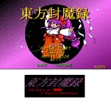
The first Touhou game to feature multiple instances of a logo by its inclusion in gameplay, extending a logo’s marketing. Except, the logo used between the title screen and the gameplay screen would differ in design hampering the memorability of a logo. This is a pattern that would continue for many Touhou games afterwards.
Title Screen | Cutscenes/Installation | Ending & Credits
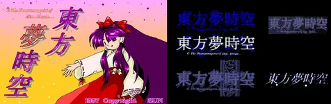
The first Phantasmagoria game has logo usage increase a lot with the logos making their appearances in the ending. Additionally, those stage transition screens now include character dialogue and even full cutscene visuals, leaving more screen time for the logo. Though, leaving the logo on screen where there is dialogue already, feels a bit tacky.
With all that said, the repeated usage of the moon character and the ellipses in the English subtitle shows they should be part of the logo. Except, online images that features PoDD logo leave off these extra characters, presumably because they don’t make up the game’s actual title.
Title Screen | Stage Transition (Left to Right, Up to Down in order of difficulty) & Installation | Ending & Credits
In terms of logo usage, LSS takes a lot from PoDD, with the only addition that the color of the logo in the stage transition screen changes based off of difficulty. As cool as this is, LLS remains as the only Touhou game to do so, with this effect not even being brought over to the next & final PC-98 game, MS.
Title Screen | Stage Transition & Installation
For the final PC-98 game, nothing was added to increase logo usage, and with exception of difficulty colors, nothing was lost as well.
By the way, the images used in this analysis were sourced from THB Wiki, Touhou Memories, and my own personal screenshots. Huge thanks to THB Wiki and Touhou Memories for cataloguing their images in an accessible format.
Part 1: PC-98 Games
CD covers of PC-98 games
In this era, how advanced a logo could be would have been limited, either by the PC-98’s technical limitations or by ZUN’s limited design experience. As a result, these upcoming logos are more or less basic, though their logo usage differs much from later Windows games. For instance, a common trend for this era is that all CD covers logos share the same style: a black inky style. It’s very basic for a logo, appearing to act more as supporting visual elements that gives the PC-98 covers an old scroll vibe to them. More importantly, these inky logos are dissimilar to the logos used ingame, a trend that would be changed in later eras. For now, let’s take a look at their digital logos.
Highly Responsive to Players
Title Screen
This is a basic Touhou logo, with white text composing of the Japanese Characters, 東方+ 靈異伝, leaving the English subtitle right below. The only unique flourish HRtP offers is the red swirl, whose curved path edges just around 方 and 異, giving off a geometric vibe. Though, the swirl centered on the bottom half of the Japanese rather than centering on the logo makes the swirl feel it was not intended to be part of the logo. Still, it is a basic logo that carries a unique visual that can be related back to the game.
As for what the red swirl means, it’s bit too abstract from the game to say an objective statement about it. But as a personal thought of mine, the red swirl is the path of the Yin-Yang orb traveling across from the edge of the screen to the center, where a boss is usually place. Of course, don’t let my thoughts be the final say about a logo’s expressions.
Story of Eastern Wonderland
Title Screen | Stage Transition
The first Touhou game to feature multiple instances of a logo by its inclusion in gameplay, extending a logo’s marketing. Except, the logo used between the title screen and the gameplay screen would differ in design hampering the memorability of a logo. This is a pattern that would continue for many Touhou games afterwards.
Title Screen
It may have be bold and large, but it’s still a basic logo design. Aside from the fact SoEW is the only Touhou game to not include an English subtitle on the title screen, it doesn’t have the unique visuals to separate this logo from regular text. It’s not bad to look at, but the design doesn’t inspire any ideas about the game aside from stating the title directly. Bit of a shame that the logo with “story” in its title can’t really have a story about its design.Stage Loading Screen
Unlike the title screen, this logo feels dangerous thanks to its dark color selection, along side the Japanese being slanted compared to the English. Not to mention, the English subtitle having “HUMA”, without any clear indicator about what it means. Perhaps these changes are to depict the darkness Reimu would travel and face head on against Mima. Regardless, for all of these mysterious visual changes, there are no visual flourishes added on, leaving this logo still quite a basic design.Phantasmagoria of Dim. Dream
Title Screen | Cutscenes/Installation | Ending & Credits
The first Phantasmagoria game has logo usage increase a lot with the logos making their appearances in the ending. Additionally, those stage transition screens now include character dialogue and even full cutscene visuals, leaving more screen time for the logo. Though, leaving the logo on screen where there is dialogue already, feels a bit tacky.
Title Screen
The Japanese is similar to SoEW, except the third character (夢) is colored differently from the rest, allowing for a visual distinction between 東方 and the rest of the Japanese character unique to that game’s title. Anyway, the English subtitle is back in red stroke, and a red moon character... Those extra characters existing make the English subtitle feel more like text, rather than as a part of the logo itself, despite the Japanese formatted to leave room for the English subtitle. For all these changes, my opinion on this logo is similar to SoEW with the lack of any strong visual elements to relate the logo to the game.Cutscenes/Installation & Ending
In my opinion, the logo’s basic layout of Japanese, combined with the English subtitles matching the color of the Japanese, and the addition of a background visual element, make for a better logo. Still, no distinctive visual element makes for a basic logo.With all that said, the repeated usage of the moon character and the ellipses in the English subtitle shows they should be part of the logo. Except, online images that features PoDD logo leave off these extra characters, presumably because they don’t make up the game’s actual title.
Credits
Funnily enough, with how basic the PC-98 logos are, the credits scene can be considered another usage of the logo. This won’t apply to the Windows games as their logo design become more developed, while the credits text remained simple. Though, in PoDD’s case, its lack of a English subtitle compared to any other credits scene of the Touhou games makes it appear as a title moreso than a logo.Lotus Land Story
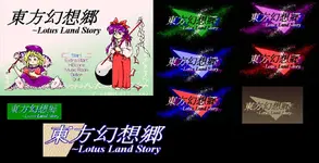
Title Screen | Stage Transition (Left to Right, Up to Down in order of difficulty) & Installation | Ending & Credits
In terms of logo usage, LSS takes a lot from PoDD, with the only addition that the color of the logo in the stage transition screen changes based off of difficulty. As cool as this is, LLS remains as the only Touhou game to do so, with this effect not even being brought over to the next & final PC-98 game, MS.
Title Screen
A basic design with dark green text that is all in italics. Italics gives depth to the logo, but without a unique visual element, there is not much to expand upon.Stage Transition Screens & Installation
See all the visual elements added? The logo certainly a carries a lot more weight with the text having a drop shadow. Though, the triangle cutting though the text makes it harder to read the text, which is not ideal when memorizing a logo with its title. While These additions are neat, they lack a clear connection to the game itself. Without a good reason why the logo has these elements, it makes it harder to connect the logo to the game itself. That is perhaps why, when people use a ingame logo, it is the title screen logo for it sheer simplicity.Credits
The credits, provides evidence of how basic the PC-98 logos are, with the credits only differing from the title screen logo in terms of color.Mystic Square
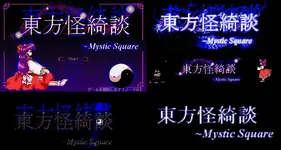
Title Screen | Stage Transition & Installation
For the final PC-98 game, nothing was added to increase logo usage, and with exception of difficulty colors, nothing was lost as well.
Title Screen & Installation
Finally, the title screen logo features visual elements in the form of a curvy mist and some glowing circles to enchant the text. To me, that gives the logo a night sky vibe, or it could perhaps be the paths of spirits. Though it seems the visual has little baring on the events that occurred ingame, it’s nice to see the final game of PC-98 close off with a little visual stinger.
Last edited:


